Trenord, web & app
Four years as lead UX/UI designer for Lombardy's main rail operator: the website, the native app, and the features commuters use every day.
Lead UX/UI designer for Trenord across every customer touchpoint, from web to the native app, with the support of the Mia-Platform teams.
A very wide range of users, many with little digital confidence. Every flow, gesture and action had to stay simple.
Studying WCAG for Trenord made accessibility part of how I design: inclusive work gives users with disabilities a better experience, and everyone else a smoother one.
Designed for people who don't like apps
Students, commuters, tourists, people who rarely use a smartphone. I looked after every customer touchpoint, from the website to the app, so the journey stays consistent at every step and matches the way people already think about taking a train.
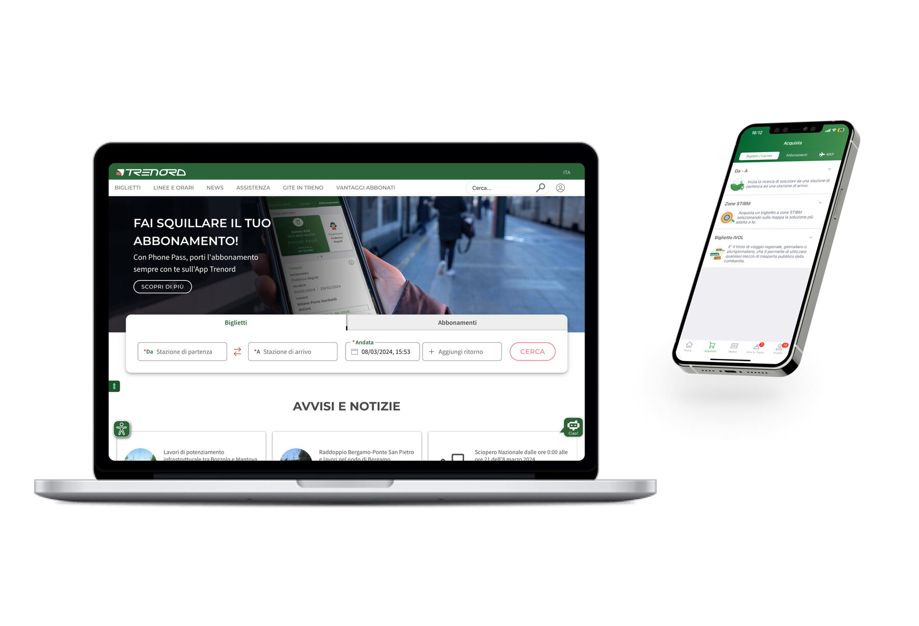
Everyone takes the train. Not everyone likes apps.
Small loops, real users
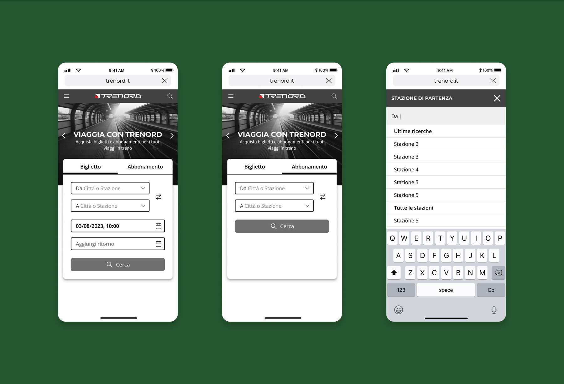
Each feature starts from Trenord's goals and from commuters' pain points. Then benchmarks, flows, wireframes, prototypes and user tests, in short agile cycles.
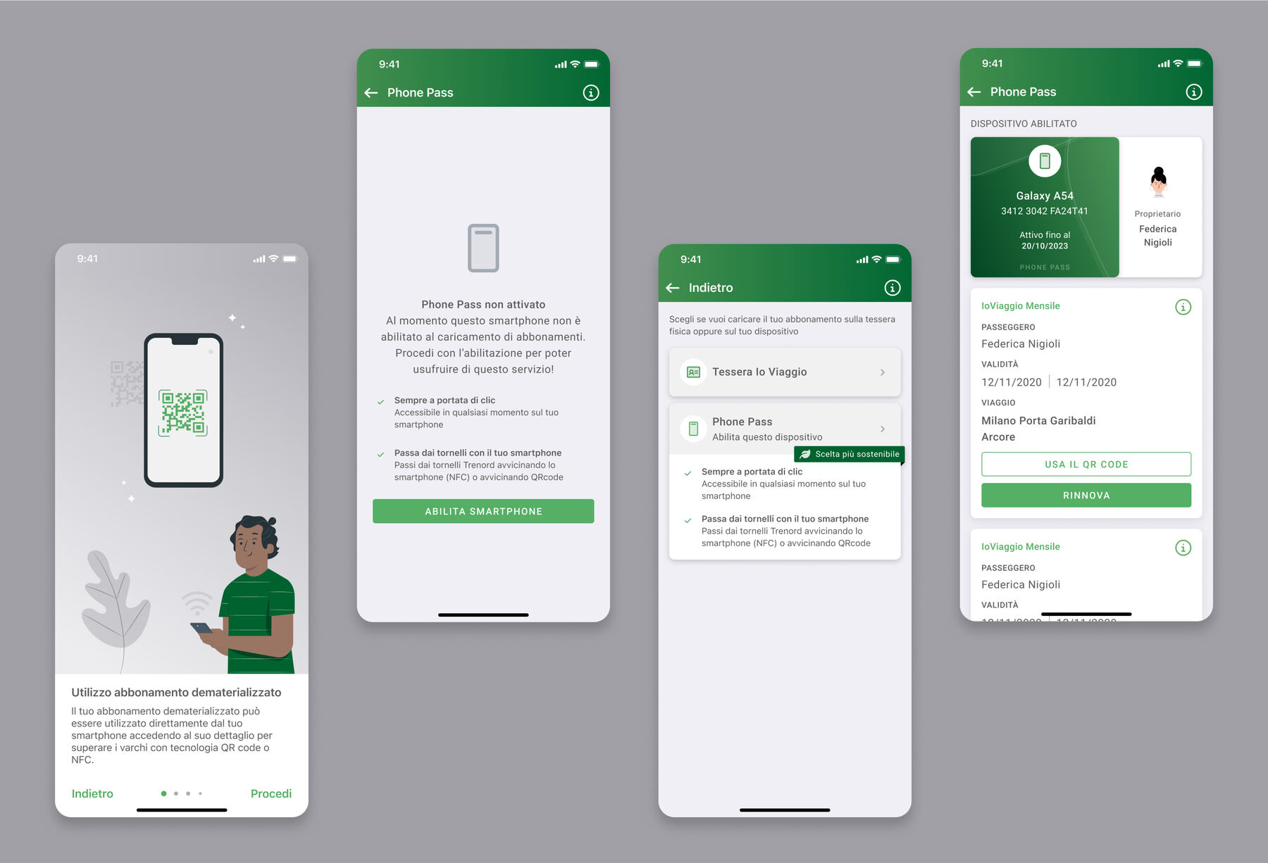
One of many: Phone Pass
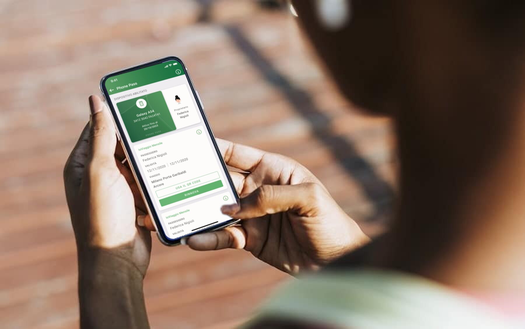
Over four years I designed many of the features now in the app. Phone Pass is one of them: a rail pass that lives only on your phone, with no physical card and no activation at the station.
✳ da completare: altre feature disegnate
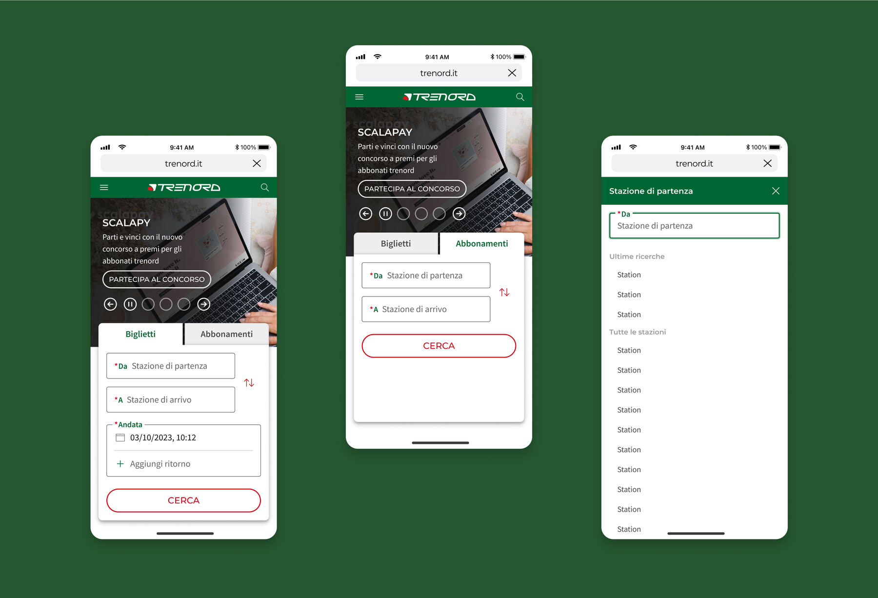
Readable on any screen
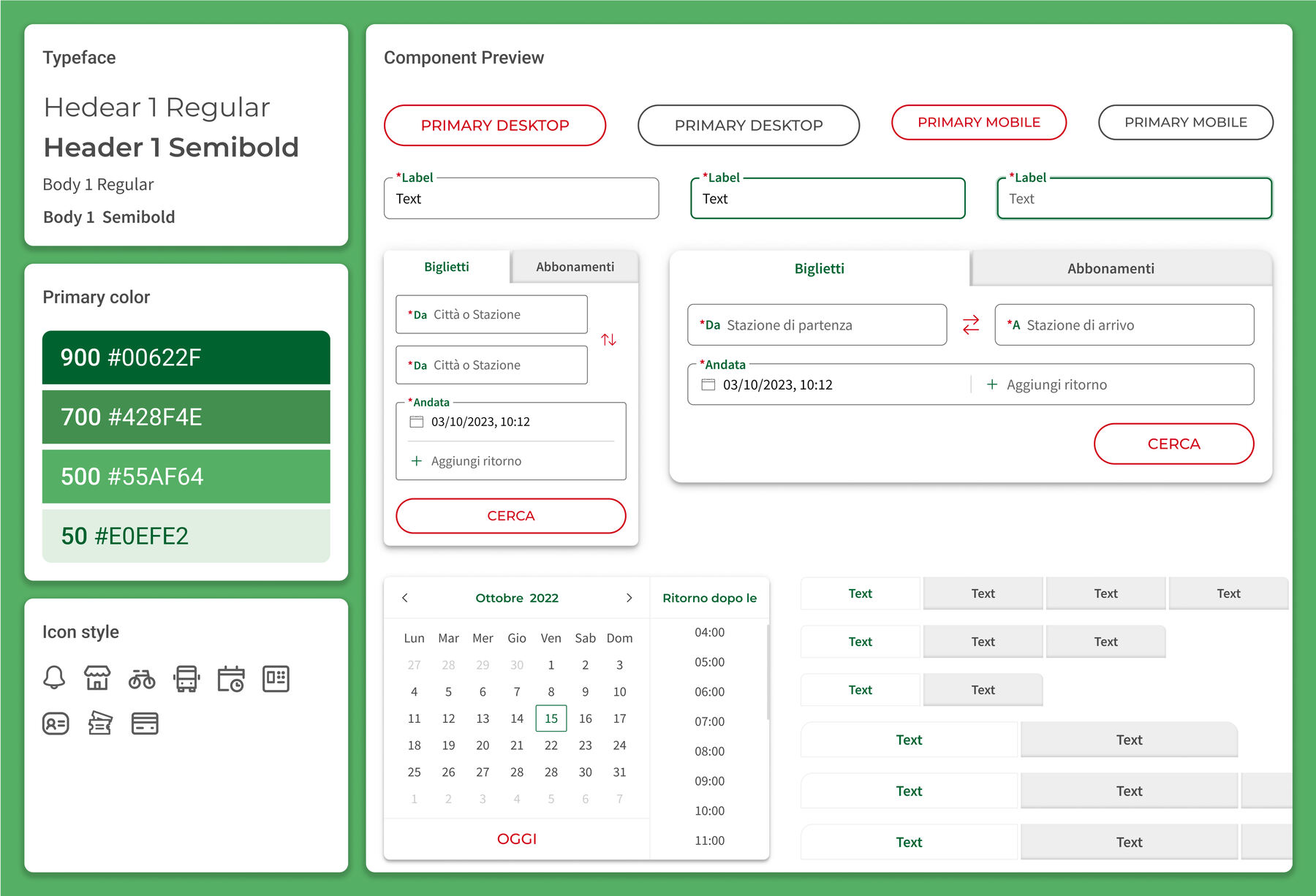
WCAG applied to typography, colours and every new component of the Trenord widget. Mobile first, so the experience stays consistent on any device.
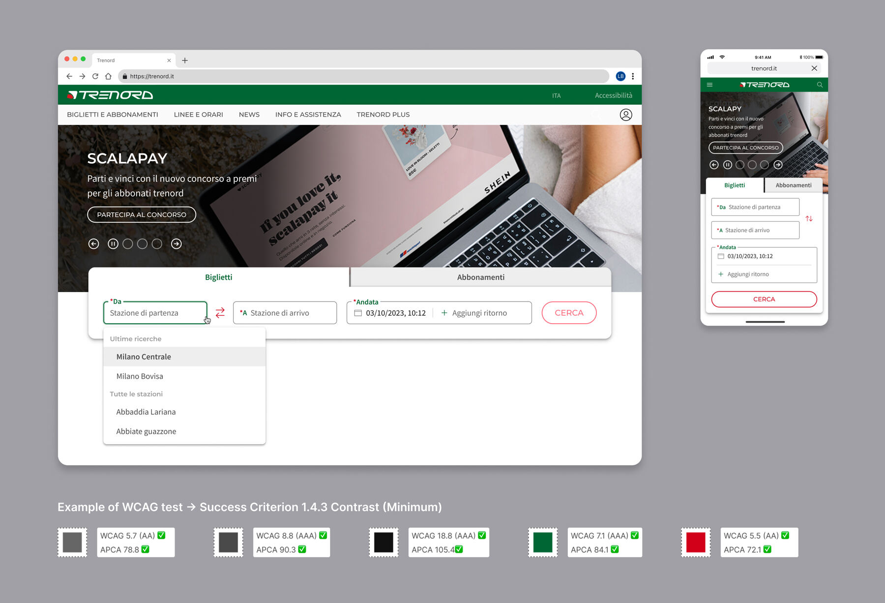
Nothing hidden
A Figma design system adapted to Trenord's brand. Auto layout and variants for every case, and every action visible: no hidden interactions.